Ever since the "New Search" was introduced, it was apparent that it would eventually supplant the "Old Search" completely. That time hasn't come yet, but it may be approaching. To their credit, Ancestry has been improving the "New Search" user interface and the search algorithm.
I looked at "New Search" again today, and found some interesting things, including the Hot Keys (introduced in October 2008 - see Anne Mitchell's Ancestry.com blog post here). Let me walk you through some screens.
In "New Search," when I click the "Search" button on the top of the Ancestry home page, this screen appears:

The Search box has entries for Name, Birth, Death and Collections. The user can check the "Exact" boxes for each criterion. On the left side of the screen is a list of the major collections. I like all of that (I really like Search boxes and links that make my path to a desired database easier).
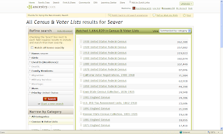
For this demonstration, I want to search Census Records for Isaac Seaver, born in 1823. I clicked on the Census and Voter Lists link and this web page appeared (two screens shown):


At the bottom of the page, I could navigate to any other record collection if I wished to rather than go back a screen.
I can input my target person in the search box - I entered Last Name = "Seaver." I clicked the "Search" box and the Search results came up (two screens):
I can input my target person in the search box - I entered Last Name = "Seaver." I clicked the "Search" box and the Search results came up (two screens):

I want to narrow my search to a specific person - Isaac Seaver born in MA in 1823. I could click on one or more of the items in the "Refine Search" box on the left side of the screen near the top of the page. That involves a click for each item, and entry of the revised search parameters.
On the left side, and near the bottom, of the web page is a list of the Hot Keys (added in 2008). They include:
n = New Search
n = New Search
r = Refined Search
p = Preview current record
> = Highlight next record
< = Highlight previous record
Rather than use the "Refine Search" entries near the top of the page to modify my search criteria, I could just type "r" (without the quotes) and a complete Search box appears:

I used this Search box to change my search parameters - I chose First name = "Isa*" and Last name = "Seav*" and added a Birth Year = "1823" with a +/- 2 year range. I clicked the "Exact" box for all three parameters. The capability to select "Exact" for any of the search parameters was added last year also. I love the flexibility of it - no other database provider has this flexibility as far as I can tell.
Then I clicked "Search" and the refined search matches were obtained:

I selected the 1900 US Census from the list, and there were two matches. I could run my mouse over the "View Record" link for each one and see the "Preview" for that record (shown below):

Instead, I could have typed the Hot Key = "p" (without the quotes) and seen the Preview of the first record. I tried to find a way to see the Preview of the second record using "p" but it didn't work for me. I tried to use the Hot Key = ">" (meaning Shift and >) to highlight and to see the preview of the next record and that didn't work. What did work was typing the "." key - the lower case of the > symbol. Likewise, the "," key moves the highlight and the preview to the previous record (rather than Shift and <).
The Hot Keys work well, and should be very useful for all researchers using the "New Search." Now that I've figured them out, I will use them extensively, since I love Search boxes and have not liked the "Refine Search" process on "New Search."
However, the Hot Keys should be much more visible to users - I think that they should be put at the top of the page above the "Refine Search" area. They are much easier to use than the "Refine Search" tools.
I would go one step further - the "n" and "r" keys don't work on the record summary or record image pages. Often, when I'm done with a record, I want to go to a Search box and either start a new search or refine the current search. Presently, I either scroll back one page at a time, or go to the "Recent pages" down arrow near the Back browser button and select a previous page with a Search obx). I recommend that Ancestry enable the "n" and "r" Hot Keys on the record summary and record image pages. "Time is money" for many researchers, and being able to navigate quickly to a new or current search box would be very useful.
Ancestry has significantly improved the "New Search" navigation and user interface to the point where I will use it as my primary user interface. Hopefully, they will continue to improve the user interface to make it easy to navigate and intuitive to use - for both novice and experienced users.
3 comments:
I do not understand what you are talking about. I went to Ancestry.com and used the "hot keys" but my search page looked the same as always. What am I missing?
I didn't see HOT KEYS either until I actually did a search. They appear on the left hand side under the "Narrow By Category Box". I have been using the "New Search" function for a while now and have been frustrated with the awkward navigation that Randy mentioned. Thanks for pointing out the Hot Keys, this will save me time and keep me motivated!
I've also been exclusively using the old search function on Ancestry.com, as the new function infuriates me. It makes it almost impossible to find what I'm looking for, whereas the old search feature works very well. I'll give the hot keys a try, though, and see if they improve the "new search" experience for me.
Stephanie at Irish Genealogical
Post a Comment