In this post, we will look at the Charts options in Family Tree Builder Version 4.0.
Starting from my father as the selected person, I clicked on the "Charts" icon and the dropdown box indicated that "Ancestor Chart," "Descendant Chart," "Fan Chart," "Close Family" and "All-in-One" charts were available. For "Ancestor" and "Descendant" charts, a "Horizontal (standard)" or "Vertical" orientation can be chosen:

I chose the "Horizontal" "Ancestor Chart" and saw this screen:

There is an "Options" button, and a "Styles" button, just above the chart area. Clicking on the "Options" button provides a menu with tabs for "General," "Facts," "Boxes," "Fonts," "Background," "Lines" and :"Language." Here are the "General" tab options:

The user can change the title (type it in the box), change then umber of generations, show thumbnail photos (or not), and control the chart orientation (horizontal or vertical).
The "Facts" tab lets the user choose from several different types of Fact collections. The default is "Common" which includes birth, death, marriage, etc. The user can add Facts to the list. The default "Common" set of Facts are Birth and Death as shown below (note that the "Places" box at the bottom is not checked):

I added "Marriage" to the list, moved it up on the Fact Selection list, and checked the "Places" box. Before I clicked "Apply," the selection of Facts looked like this:

The "Boxes" tab permits the user to choose a background color, to color the boxes by gender (colors can be modified), choose box line border colors and widths, and a box shadow. The default choices are shown below:

I changed some of these items. The "Fonts" box permits the user to change the Font type, font size, choose bold or italics, and the font color for every text item on the chart. In the screen below, I am changing the font color for the Name:

The "Background" tab permits the user to select a background color, or to select a background photograph from the photos previously added to the program, and to put a frame around the chart. In the screen below, I selected a background photograph, but I didn't have any photos uploaded to the program yet.

In the "Lines" tab, the user can select from straight or diagonal lines between persons, select the line width and color, and check boxes to display non-natural parent-child relationships, or non-married spouse relationships with a dashed line. In the screen below, I chose a line width and color for the lines:

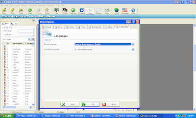
The final tab is for "Languages." The user can choose the primary language, and the secondary language, from a list of the 35 languages in the FTB 4.0 software. I kept English as the display language:
Having gone through all of the tabs on the "Chart Options" menu, I clicked on the "Apply" button and then the "OK" button to see my beautifully designed Ancestor Chart:

The "Styles" button above the chart view has a variety of Chart Styles. I clicked on that to see what it was, and saw:
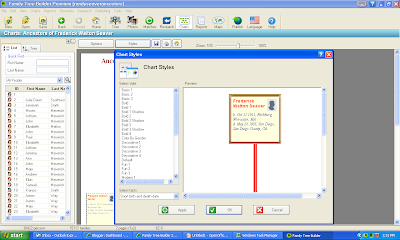
The list of Styles is on the left of the "Chart Styles" menu. My current "Style" is shown. I decided to choose the "Color by Gender" Style (which makes the background for males light blue and for females light pink):
I clicked on "Apply" and "OK" and the chart changed to reflect my choices. The box borders, lines, and text reverted to the default option for the selected "Chart Style." Here is the Ancestor Chart with the default "Chart Style" parameters:


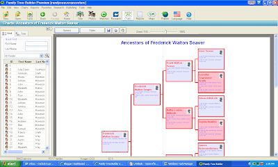
Having gone through all of the tabs on the "Chart Options" menu, I clicked on the "Apply" button and then the "OK" button to see my beautifully designed Ancestor Chart:

The four-generation chart above is on two 8.5 x 11 pages. It has placeholders for thumbnail photos because I didn't modify that option. The box borders, lines, and text reflect the options I chose.
The "Styles" button above the chart view has a variety of Chart Styles. I clicked on that to see what it was, and saw:

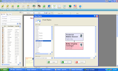
The list of Styles is on the left of the "Chart Styles" menu. My current "Style" is shown. I decided to choose the "Color by Gender" Style (which makes the background for males light blue and for females light pink):

I clicked on "Apply" and "OK" and the chart changed to reflect my choices. The box borders, lines, and text reverted to the default option for the selected "Chart Style." Here is the Ancestor Chart with the default "Chart Style" parameters:

I had to go back into all of the "Chart Options" in order to put some color into my Ancestor Chart, as shown below:
That four-generation chart is now on four 8.5 x 11 pages. I could reduce the size down by reducing font size and perhaps eliminating the Place data.
One lesson learned here is to do the "Styles" selection first. Explore the different "Styles" before you use the "Options" button to change Facts used, box, line and font display data.
We will look at other chart types, with some interesting backgrounds and content, in the next post.

That four-generation chart is now on four 8.5 x 11 pages. I could reduce the size down by reducing font size and perhaps eliminating the Place data.
One lesson learned here is to do the "Styles" selection first. Explore the different "Styles" before you use the "Options" button to change Facts used, box, line and font display data.
The user can Save the Chart, or Print the Chart, by clicking on the icons in the area above the Chart - next to the "Styles" button.
The "Charts" function works very well in this software. The menus are logical and permit the user to tailor the chart to their aesthetic desires. I do like RED!
The "Charts" function works very well in this software. The menus are logical and permit the user to tailor the chart to their aesthetic desires. I do like RED!
We will look at other chart types, with some interesting backgrounds and content, in the next post.
1 comment:
The Title for charts isn't persistent. The Title for a chart with John Smith at the top is entitled by default to 'Descendants of John Smith'. You can change this, for example to 'The Smiths of Rhode Island' (because John Smith was the first to arrive). But if you then make updates to the tree, then generate a chart again, the Title you set previously is lost, and it reverts to the default 'Descendants of John Smith'.
Post a Comment